Jira
Jira monday.com


When information is scattered across multiple boards within monday.com, it can be challenging to maintain a clear understanding of your project’s status. The lack of a centralized view leads to missed deadlines, miscommunication, and confusion over priorities.
monday.com dashboards aim to solve this challenge by providing a bird’s-eye view of your tasks, timelines, and progress.
In this article, you’ll discover what monday.com dashboards are, how they boost productivity, and gain practical tips for building an effective dashboard with examples.
What is a monday.com Dashboard?
A monday.com dashboard is a centralized hub where you can organize data from multiple boards, offering summaries, reports, and metrics. The dashboard is comprised of various widgets, such as graphs, pie charts, timelines, and task trackers, which you can customize to create a tailored view of the most relevant information.
In addition to customization, dashboards offer adjustable access management, allowing them to be kept private for personal tracking or shared with teams. This makes monday.com dashboards an excellent tool for staying aligned and making informed decisions across teams. Dashboards can also be viewed on the monday.com mobile app, allowing you to stay updated on the go.
Now, let’s explore the essential widgets that make dashboards such a practical tool for managing and visualizing projects.
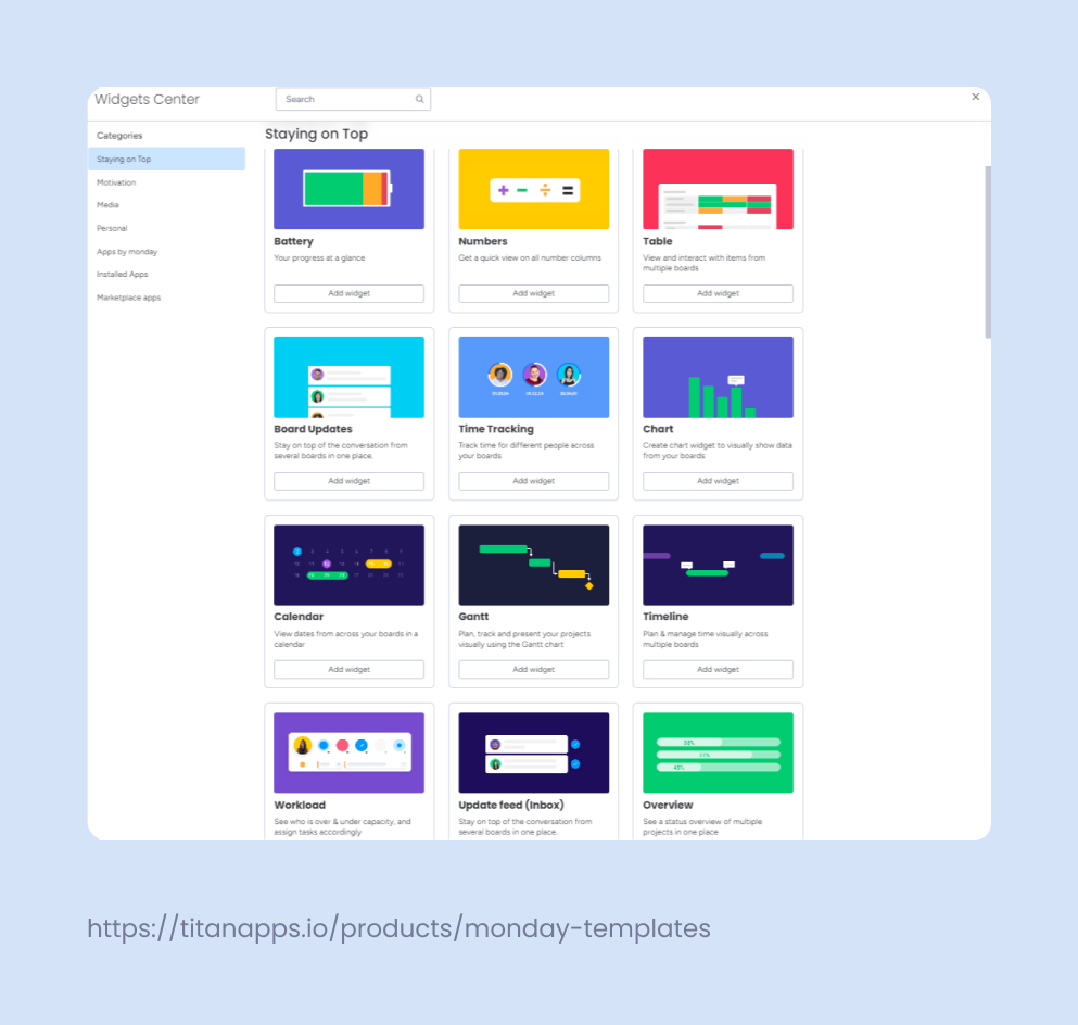
Key Dashboard widgets
monday.com dashboards offer a range of widgets tailored to different needs, providing both clarity and flexibility for managing projects. These widgets are grouped into the following categories:
- Staying on Top: This category includes most of the essential widgets you need to track progress and workload across projects. Time Tracking and Battery widgets help monitor basic task progress and time spent. More advanced widgets, common in project management, such as Gantt charts, Timelines, and Workloads, allow you to plan, visualize, and manage project timelines, deadlines, and team capacities.
Additionally, Chart, Table, Overview, and Numbers widgets provide quick views and insights, making it easy to stay informed on key metrics.
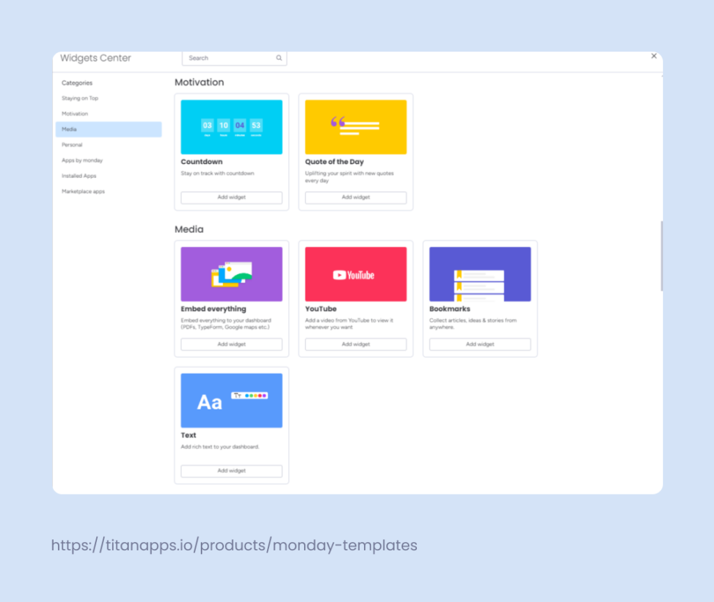
- Media: This section offers widgets, such as YouTube or ‘Embed Everything,’ that allow teams to store and display media files within the dashboard.
For example, a marketing team managing a campaign can embed ad videos directly within the dashboard, ensuring the entire team has quick access to the latest campaign assets. This not only centralizes access to important content but also speeds up feedback loops, leading to overall improved performance.
- Personal: Includes widgets like To-Do List and “I Was Mentioned” to manage personal tasks, notifications, and priorities.
- Motivation: Features widgets like the Countdown, which helps teams stay motivated in a fun way.
Beyond the built-in widgets, monday.com offers both native and third-party app integrations for a more advanced dashboard functionality. For example, the Embedded Data Studio widget lets you pull Google Data Studio reports into your dashboard, providing real-time access to visual reports for quick data analysis.
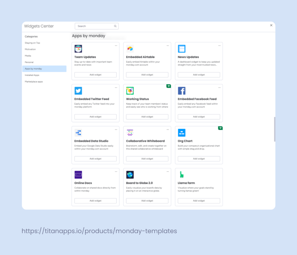
Other third-party apps, such as Jira, Canva, Calendly, HubSpot, Tableau, and many more, allow teams to bring data from these popular tools directly into monday.com. These apps can enhance your dashboard’s functionality by connecting various data sources, allowing you to manage design, scheduling, CRM, and data visualization all in one place.
How to create a monday.com Dashboard?
Creating a dashboard in monday.com is a straightforward step-by-step process and can be done either from within a workspace or directly from a specific board.
Simply navigate to your workspace, click on “Add New,” and choose “Dashboard.” Next, choose whether you want the dashboard to be “Private” or “Main,” and select the boards you’d like to include. From there, you can add widgets to customize the dashboard based on your needs.
For detailed, step-by-step instructions, you can refer to the official monday.com documentation.
Examples of monday.com Dashboards you can build
Let’s explore some practical examples of dashboards you can create using monday.com. These examples show how different widgets can be put together to address specific needs and improve overall productivity.
- Project Management Dashboard
- Gantt
- Workload
- Timeline
As an example, let’s take a project manager in a software development company who faces challenges coordinating tasks among remote team members spread across time zones. When one task is delayed, team members in other time zones either have to wait for updates or start working without the necessary information, causing further delays and confusion. This results in bottlenecks and disrupts the entire workflow.
A Project Management Dashboard provides a unified view of tasks, timelines, and team capacities, allowing the project manager to coordinate effectively across time zones. It visualizes task dependencies, identifies delays early, and balances workloads based on team availability.
- Sales Performance Dashboard
- Chart
- Numbers
- Timeline
Imagine a sales manager dealing with long sales cycles. It’s challenging to track progress and pinpoint where deals stall. Without a clear view of sales performance metrics and the stages in the sales funnel, it’s difficult for her to determine which strategies are effective and where to focus efforts.
A Sales Performance Dashboard consolidates all essential sales metrics in one view, enabling the sales manager to identify precisely where deals get stuck and measure the effectiveness of various strategies. By visualizing the sales funnel and tracking KPIs, the manager can quickly pinpoint issues and adjust efforts to shorten the sales cycle.
- Marketing Analytics Dashboard:
- Chart
- Calendar
- Table
Picture a situation where a marketing manager is running a multi-channel ad campaign. Tracking performance metrics and campaign schedules across different channels becomes chaotic, making it difficult to assess which channels are performing well and whether campaigns are being launched on time.
A Marketing Analytics Dashboard collects performance metrics and campaign schedules in one place, giving the marketing manager a clear view across all channels. It helps the manager see which platforms are working best, keep campaigns on schedule, and make quick adjustments for better results.
- Personal Productivity Dashboard
- To-Do List
- Calendar
- “My Work”
Take, for example, a freelancer who struggles to stay productive due to multiple ongoing projects and the constant need to find new clients. Managing tasks, appointments, and client communications without a system make it easy to miss deadlines and lose track of important details.
A Personal Productivity Dashboard provides a quick overview of tasks, appointments, and client communications all in one place. By keeping the dashboard open, the freelancer has a constant reminder of priorities, deadlines, and updates, helping stay organized and consistent.
Best practices for monday.com dashboards
When setting up your dashboards, keeping a few key principles in mind will ensure they remain clear, actionable, and effective for your team. Here are the top best practices to follow:
1. Define the purpose of the dashboard and what problems it should solve.
Before you build your dashboard, understand why you need one in the first place. What problems does it need to solve?
For example, is it to track project deadlines and ensure timely delivery, or is it to monitor sales performance and identify trends? Once you define this, you’ll have clarity on how to build a dashboard that is both purposeful and efficient. Purposeful dashboards aren’t just for businesses—nonprofit project management benefits too, as it helps to coordinate volunteers, track donation use, and plan events effectively, all from a single dashboard view.
2. Work with your team to identify the key metrics.
Once you define the dashboard’s purpose, meet with your team members to identify the key metrics that align with your goals. This ensures that your dashboard reflects shared priorities and keeps everyone focused.
As an example, a sales team might prioritize metrics like revenue growth and conversion rates. Be selective about what you display—focusing only on the most critical metrics helps avoid clutter and keeps your team from being overwhelmed by too much data.
3. Only include information that you’ll use regularly.
Limit the dashboard to data that provides ongoing value. Temporary or rarely used information, like one-off reports, can clutter the dashboard and reduce its effectiveness.
For example, avoid displaying last month’s social media campaign metrics if they’re no longer relevant. Keep the focus on consistent metrics that offer long-term insights.
4. Ensure all data is actionable.
Every widget should provide data that drives action. If a widget doesn’t help your team make decisions or adjust strategies, consider removing it. Prioritize insights that enable your team to make timely adjustments, spot potential issues, or track progress toward goals. Remember, simplicity is key. Focus on what truly matters and display data that directly impacts your decision-making.
5. Review and update the dashboard with your team regularly.
Dashboards are not static tools. Set a schedule to review and update them with your team. This helps ensure the data stays relevant as priorities evolve. For example, if a project moves from planning to execution, you might shift the focus from resource allocation to performance tracking.
A well-designed dashboard can be the key to keeping your projects on track and strengthening teamwork. Try out these examples, experiment with widgets, and create a dashboard that works best for your needs. Best of luck building your ideal dashboard and enjoying the process!