Managing multiple projects and deadlines becomes challenging when crucial information is spread across different places. This lack of centralization usually leads to miscommunication, missed deadlines, and poor decision-making.
Dashboards offer a solution by consolidating key data into one centralized location, helping teams stay aligned, informed, and able to act on accurate, up-to-date insights.
In this article, I’ll explore how dashboards, particularly those integrated into platforms like monday.com, simplify workflows. I’ll highlight some of the most effective dashboard templates and share practical tips for designing dashboards that drive better decision-making and team collaboration.
What are Dashboards and how are they used?
Dashboards, which use various graphs and platform-related widgets, provide a clear and organized visual display of key metrics, deadlines, project progress, resource allocation, communication updates, and more, enabling teams to stay on top of their tasks and make well-informed decisions. Different teams leverage dashboards for various purposes, for example:
- Marketing teams: Track campaign engagement, monitor budget allocation, and timely campaign execution.
- Sales teams: Evaluate pipeline health, monitor lead conversion rates, and track KPIs with funnel charts and numerical summaries.
- Project managers: Monitor project timelines and evaluate workload allocation.
- Finance teams: Manage cash flow, monitor spending patterns, and review ROI trends.
While each team uses dashboards differently to keep an eye on performance and drive decisions, it all comes down to how dashboards transform raw data into clear, actionable insights through individual components. Here are some of the core building blocks of dashboards:
- Bar Charts: Ideal for comparing data across categories, such as tracking monthly revenue for different product lines.
- Pie Charts: Perfect for visualizing proportions, like the breakdown of budget allocation across departments.
- Line Charts: Great for identifying trends, like monitoring campaign performance over time.
- Gantt Charts: A must for project planning, can display task dependencies and timelines for easier coordination.
- Number Widgets: Provide an at-a-glance understanding of key metrics, such as total sales or current ROI.
Tips to get the most from your monday.com Dashboard
1. Determine the purpose: Before setting up your dashboard, define its primary goal. What problem are you trying to solve? Whether you’re tracking project deadlines or monitoring sales performance, having a clear objective will help you design a useful dashboard.
2. Focus on key metrics: Once the purpose is established, collaborate with your team to identify the most critical data sources and metrics. Prioritizing key ?data keeps your dashboard focused and ensures alignment across your team. For instance, a marketing team might prioritize metrics like campaign engagement rates and lead generation. By highlighting critical metrics, you’ll avoid unnecessary clutter and maintain clarity.
3. Include information that is used often: A dashboard should only contain data that is valuable on an ongoing basis. Having irrelevant or outdated information, such as one-time reports, can make it harder to navigate and reduce overall effectiveness.
4. All data should be actionable: Each element of your dashboard should offer data that leads to action. Don’t add a widget that doesn’t help the team make meaningful decisions or adapt strategies.
5. Routinely update the dashboard: Projects evolve; they may expand, shrink, or even merge with other initiatives. It’s important not to overlook updating your dashboard to reflect these changes. Schedule regular reviews and adjust the dashboard so it provides accurate and relevant information.
Understanding monday.com Dashboards templates
monday.com structures workspaces using boards, groups, items, and subitems, creating an efficient system for organizing tasks. While you can build boards to meet your unique requirements, the platform also provides a wide range of pre-built board templates designed to simplify setup and minimize errors.
These templates are located in the Template Center, featuring hundreds of options across various industries and functions. Each template is fully customizable, allowing you to tailor it to your work management processes and save it as a personal template for future use.
Access permissions are also flexible, letting you make entire boards private or share them with your team members while controlling who can view or modify specific groups, items, subitems, and columns.
In contrast to boards, monday.com dashboards act as a centralized hub for visualizing data from multiple boards, groups, items, etc., in real time.
Available monday.com widgets
monday.com offers a wide range of widgets categorized to support different business needs:
Staying on Top: Essential for tracking progress and managing workloads, these widgets include tools like Time Tracking and Battery widgets for basic monitoring. Gantt charts, Timelines, and Workloads allow users to visualize project timelines and team capacities. Additional widgets, such as Chart, Table, Overview, and Numbers, provide quick overviews of important metrics, ensuring users stay informed.
Media: Widgets like YouTube and Embed Everything brings media content directly into dashboards. For example, a marketing team can embed promotional videos or campaign drafts for centralized access, enabling faster feedback cycles and better collaboration.
Personal: Features such as the To-Do List and “I Was Mentioned” widgets help individuals effectively manage tasks, notifications, and priorities.
Motivation: Fun, motivational widgets like the Countdown add a personal touch by highlighting key deadlines or events, keeping teams engaged.
Beyond the built-in widgets, there are third-party integrations, such as real-time reports from Google Data Studio. Other integrations, including Canva, Calendly, HubSpot, and Tableau, centralize workflows across platforms. This is useful in many situations, for example, when you need to add LinkedIn contacts to HubSpot CRM.
Just like board templates, monday.com dashboards can also be customized for individual and team use, and privacy settings can be changed to secure sensitive information. With mobile access via the monday.com app, you can stay updated on the go.
It’s important to note that monday.com doesn’t offer standalone dashboard templates. However, many of the most popular board templates already include preconfigured dashboards.
Top monday.com Dashboard templates
1. The Event Management template provides a comprehensive toolkit for organizing events, complete with a detailed event planning board, checklist, and RSVP board connected to submitted forms. This template’s dashboard helps with decision-making by visualizing important event metrics for all stakeholders.
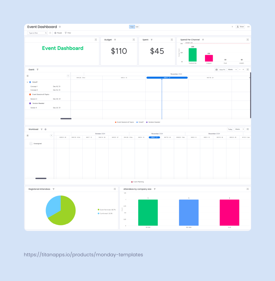
Event managers can track budget allocation and spending with dedicated numbers widgets, allowing for quick resource adjustments where and when needed. Attendee registration charts show the number of confirmed guests over time, allowing planners to track sign-up trends and forecast attendance. Company size segmentation charts provide a breakdown of attendees by organization size, helping organizers tailor outreach and event content to their audience.
2. Basic CRM is a perfect template for sales teams with straightforward workflows. The template includes a board for managing leads and one for monitoring their progress. The dashboard displays key insights such as sales performance, average deal value, and revenue growth KPIs.
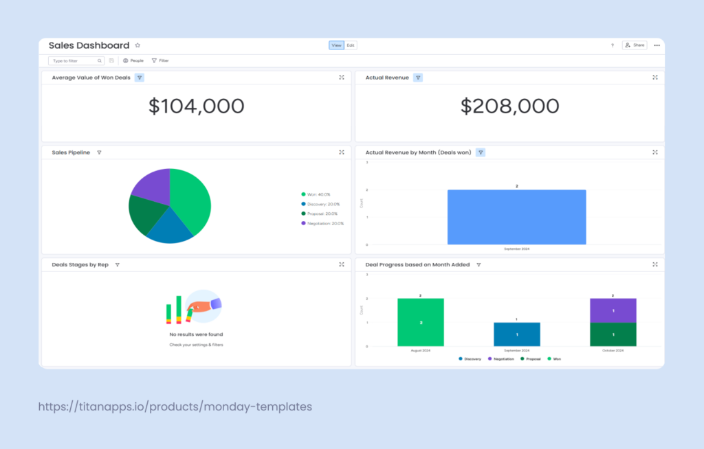
Additionally, various charts illustrate the number of leads at each stage of the sales funnel and show monthly performance trends. This helps sales managers assess team progress, identify bottlenecks, anticipate periods of high or low activity, and adjust strategies accordingly.
3. The Financial Statement template helps businesses monitor outgoing cash flow by tracking payments, outstanding balances, and upcoming payment due dates. This provides a transparent view of spending patterns, making it easier to manage and prepare for future expenses.
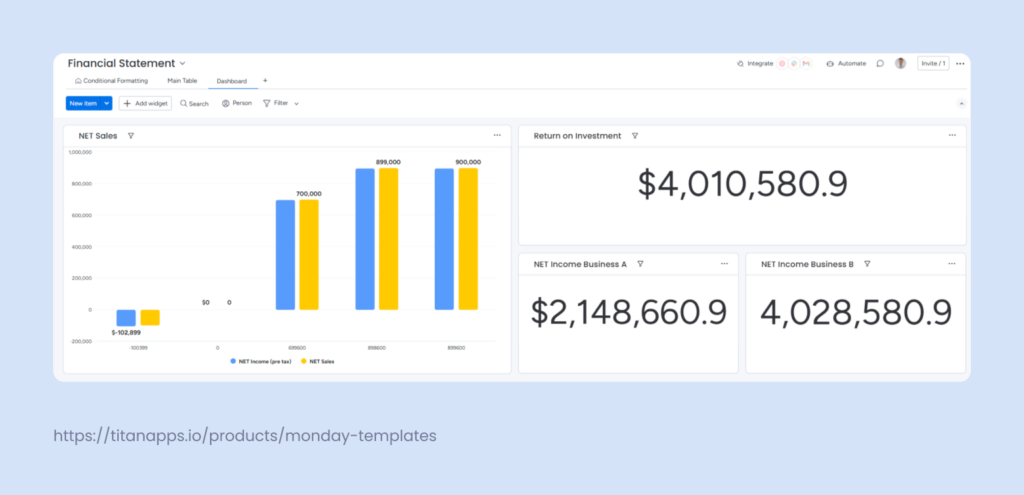
The dashboard features a bar graph and numbers widgets that show ROI and net profit summaries from different sources. Additionally, a cash flow timeline widget can easily be added to the dashboard since it’s already set as a “view” in one of the boards. It offers a clear picture of upcoming payments, helping teams plan and manage financial resources.
4. Risk Register template has a single board that helps C-level management to track project risks. Projects are organized into groups, with each risk recorded as an item with columns detailing severity, probability, potential impact, damage, and mitigation costs. While this board is excellent for logging risk details, understanding the full scope of risks from it can be challenging.
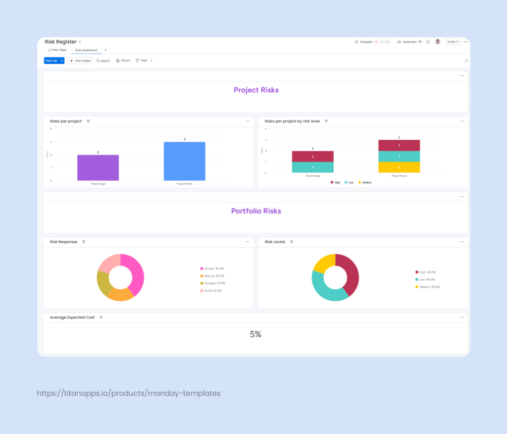
Luckily, the dashboard addresses this by taking the raw data from the board and visualizing it. Bar charts display the number of risks per project and categorize them by severity level. Pie charts illustrate the percentage breakdown of risk response strategies and risk levels.
A customizable numbers widget highlights the expected cost of risks. You can adjust units to show values in various currencies or percentages and apply functions like Sum, Average, Median, Min, Max, or Count for more in-depth analysis.
5. Monday Marketer template is designed to streamline and centralize marketing operations in one place. It includes a board for outlining and managing marketing strategies and one for tracking and organizing marketing asset requests. Lastly it features a content calendar to oversee publishing schedules.
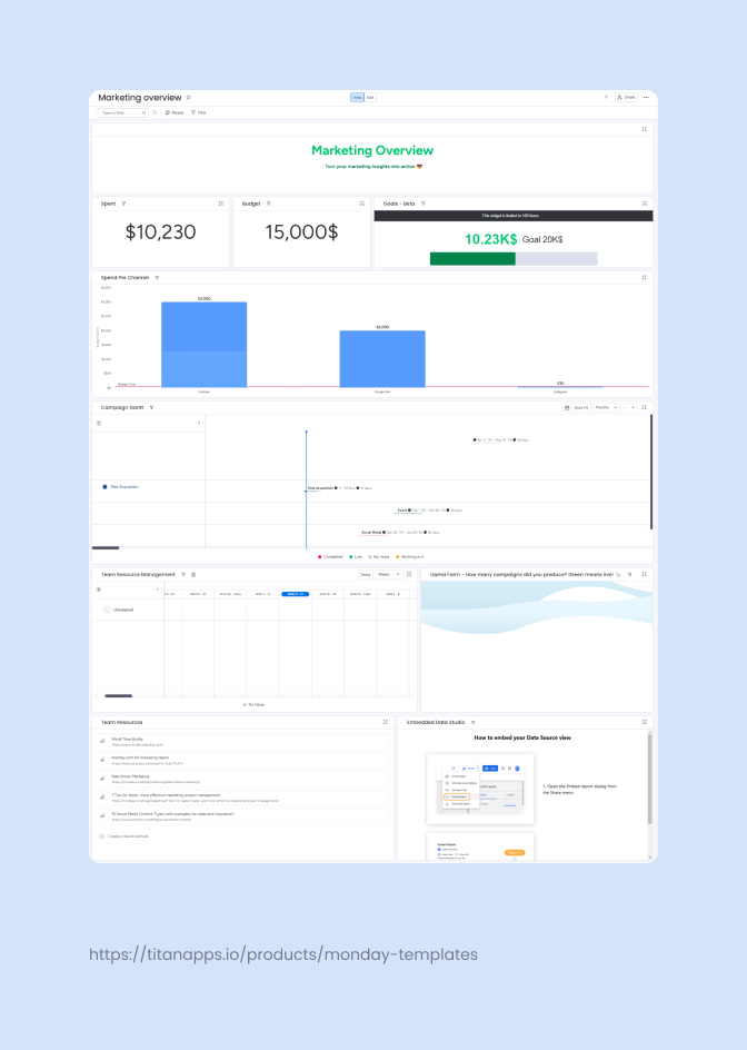
The marketing overview dashboard presents key metrics, such as campaign timelines, budget usage, and content performance, through an integration with Google Data Studio. Although the Creative Requests board isn’t linked to the dashboard by default, you can easily connect it and customize the dashboard further, just as you would when building any dashboard from scratch.
Creating your own Dashboard
Whether you are a beginner or a pro, building a dashboard in monday.com is easy and intuitive. You can create one directly from a workspace or link it to specific boards as needed.
To start, navigate to your workspace, select “Add New,” and then choose “Dashboard.” You’ll be prompted to decide if the dashboard should be “Private” or “Main,” followed by selecting which boards to pull data from. Once your boards are linked, you can add and configure widgets to create a dashboard that best meets your needs.
For step-by-step guidance, you can check the official monday.com documentation.
Using monday.com dashboard templates can be a game changer for teams that need to track progress and make data-driven decisions quickly. Start by defining your purpose, focusing on key metrics, and maintaining an updated, user-friendly interface. Whether you’re tracking campaign success, overseeing sales pipelines, or managing budgets, dashboards help you stay in control. So put on some lo-fi focus music, dive in, and enjoy the dashboard-building process!